Sometimes you may lose track of whom you need to communicate to. Use the following Horenso Visual Chart to make sure everyone stays in the loop.

Sometimes you may lose track of whom you need to communicate to. Use the following Horenso Visual Chart to make sure everyone stays in the loop.
Step 1 - Create the Table
Create a spreadsheet like in the example below. The first column should be left blank, for you to write down topics, tasks or updates that need to be communicated. Since the sheet will be printed out, make sure the cells are large enough to handwrite topics in.

The first row should contain the ho-ren-so (report, update and consult) classifications, and underneath that should contain all the names of people you need to communicate information to, clearly sorted under ho-ren-so. You must not have the same name under more than one category because it wouldn’t make sense: your client can’t also be your supervisor.
In this example, everyone under report (hokoku) are project supervisors, people under update (renraku) are team members, while we will assume all our stakeholders under consult (sodan) are our customers
To make your chart a better visual, you may want to add photos of these people as well.
You will find that there are fewer people under “Ho” because you will often have only one or two team leaders. The other two categories may be filled to the brim with people.
Step 2 - Print it out
Print the spreadsheet out on A3 paper and place it somewhere you can easily see, like the wall of your office or beside your computer. It’s important for you to see it all the time, as it will be a stimulus for you to act.
Step 3 - Write down the issues
If you have a topic or issue to communicate with people, write the topic down on your ho-ren-so sheet first under the “Task/Development/Update” column. Make sure to cross out people who you will not communicate the topic with, while ticking the names of people you have communicated to.
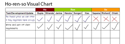
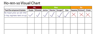
For example, let’s say we’re running a management consultancy service, and that I’ve just spoken to my supervisor Gupta on the lowest prices we can offer to our customer, depending on how hard they bargain. I would want to share that information with the other people in our team so we present a united front, but I would not want our customers (Sapama, Richard and Chiaki) to know this tactic. As you can see, I’ve crossed out Sapama, Richard and Chiaki from this particular topic.

After I send an email to the rest of the team informing them of the pricing scheme, I then tick off the names of Janice, Haruka, Songsri and Xiao, as well as Miranda, the second project supervisor

Step 4 - Add information as necessary
Add tasks, developments and situation updates, as well as names to the chart as necessary. Since your project is always changing, so too should your horenso chart.
For example, let’s assume that the client has decided to use our services and that we have had our first meeting to discuss their requirements in detail. I have written them up and emailed it to them for confirmation, as well as to the rest of our team so they stay in the loop. Hence I would add another task to the chart, and tick off each individual when I have sent off the email to them.

Download
You can download a blank ho-ren-so chart template to modify below in either Microsoft Excel format or Open Document Spreadsheet format.
- Download ho-ren-so chart
[##download## Excel .xls] 15k
You can read more about horenso (effective communication), PDCA (Plan-Do-Check-Act), mieruka (use of visuals) and 5-why here, which also includes articles, tutorials and downloadable diagrams, sheets, PDFs and other tools to help you implement kaizen and bring the competitive edge of the Toyota Way to your manufacturing or service-industry project or organization.


Comments